Minimalism gets blamed for a lot of things it didn’t actually cause. “Cold,” “empty,” “unfinished” these complaints usually aren’t really about having too little furniture or too few colours. They’re about a room that’s flat in every sense: same surface finish throughout, same sheen, nothing for the eye to catch onto as it moves around the space. Strip away the clutter, and you still need something to hold a room together, and that something is rarely more furniture. It’s texture.
This is where a lot of minimal interiors go wrong without anyone quite noticing why. The instinct to simplify often gets applied to materials as aggressively as it’s applied to decor, and the result is a room that’s technically uncluttered but visually inert. The fix isn’t adding more; it’s choosing surfaces that do more with the same restrained palette.
Minimalism Was Never Supposed to Mean "Flat"
Somewhere along the way, “minimal” got conflated with “smooth.” Glossy white cabinets, flat painted walls, sleek uninterrupted surfaces this became shorthand for a clean, contemporary look, and it’s not wrong exactly, but it’s incomplete. The most successful minimal interiors, the ones that photograph well and feel good to actually live in, almost always have texture doing quiet work somewhere in the room.
Why the Eye Needs Something to Register
Here’s the underlying mechanism, stripped of design jargon: a completely flat, evenly lit surface gives your eye nothing to focus on. There’s no variation for your vision to lock onto, so the surface reads as background present, but essentially invisible. Add texture, even subtle texture, and suddenly there’s variation in how light bounces off different points of that same surface. Your eye tracks that variation, and the brain interprets it as depth, dimension, something worth noticing.
This is precisely why a minimal room with one textured wall or one raw-finish piece of furniture tends to feel more considered than a room where every surface is uniformly smooth. The textured element gives the eye an anchor point. Without it, a minimal space can start to feel less like restraint and more like absence.

The Materials Doing the Heaviest Lifting
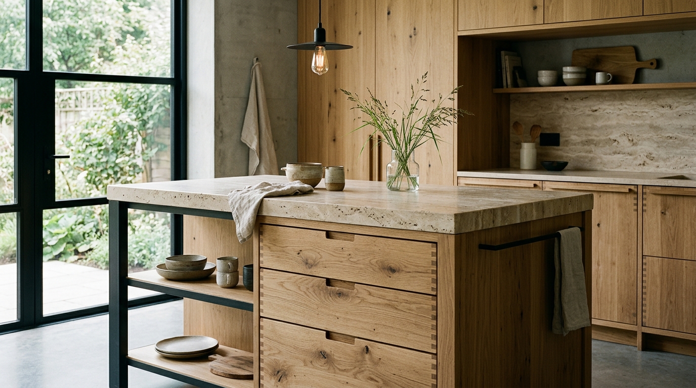
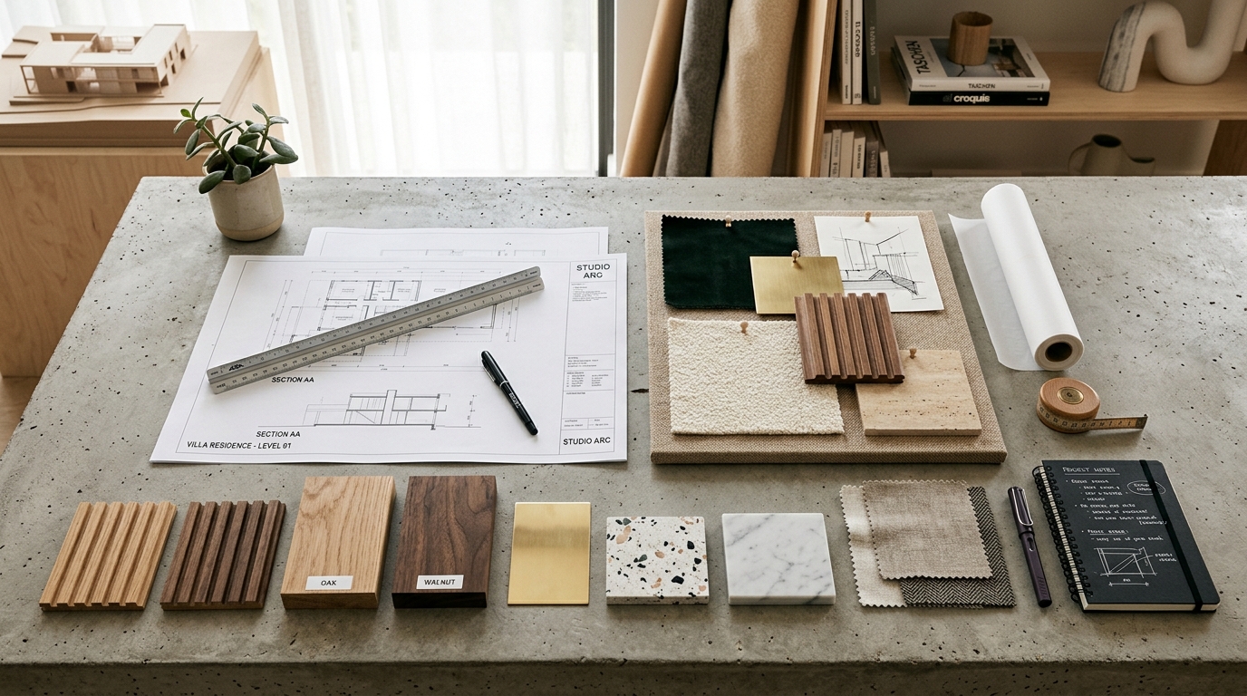
Wood grain and natural finishes. Even at its most understated, wood carries a visible pattern that painted MDF or laminate simply can’t replicate. A single piece of furniture in natural wood, left unpainted, often does more to anchor a minimal room than several additional decorative objects would.
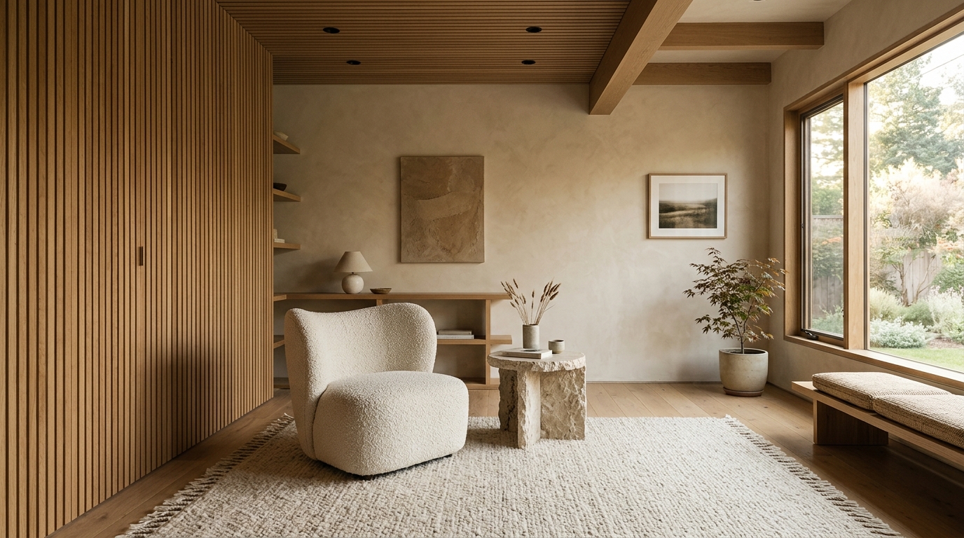
Linen, wool, and boucle textiles. Soft furnishings with visible weave add tactile variation without introducing pattern or colour, which keeps them compatible with the restrained palette minimalism typically calls for.
Raw or honed stone. Unlike polished marble, honed or raw-finish stone has a slightly matte, textured surface that catches light unevenly, useful on countertops, feature walls, or flooring where you want material presence without shine.
Fluted and grooved panelling. Vertical grooves cut into a wall or cabinet front create rhythmic shadow lines that shift throughout the day, giving an otherwise plain surface a sense of movement a flat painted wall can’t offer.
Woven or caned elements. Cane webbing on cabinet doors, rattan light fixtures, or woven baskets bring in organic texture at a small scale, useful for rooms where a full textured wall would feel like too much.
Layering Texture Without Breaking the Minimal Rule
The real skill in minimal design isn’t restraint for its own sake; it’s knowing exactly where to spend visual attention and where to hold back. Texture works best when it’s concentrated rather than scattered evenly across every surface in a room.
A useful way to think about it: pick one or two “anchor” textures per room, and let everything else stay genuinely quiet around them. A ribbed wood cabinet front paired with a linen sofa and otherwise flat walls reads as intentional. The same ribbed cabinet, a woven pendant light, a jute rug, and a textured accent wall all in the same room start competing with each other, and the minimal foundation gets lost under the weight of too many competing textures.
Repetition of material also matters more than people expect. If wood grain is the chosen texture for a room, letting it show up in two or three places a console table, a door, a shelf edge reads as cohesive. Introducing three or four completely different textures across the same small space tends to read as busy, even if the colour palette stays perfectly restrained.
Light Is the Other Half of This Equation
Texture without the right lighting mostly disappears. Flat, even overhead lighting flattens shadow and washes out a lot of the depth that grain, weave, or grooves are supposed to create. Angled light from a wall-mounted fixture, a lamp placed to one side, or natural daylight coming in low through a window is what actually let’s texture do its job.
This is worth raising specifically because a lot of minimal interiors lean on recessed ceiling lighting for its clean, unobtrusive look, without accounting for how flat that lighting makes every surface underneath it. A single well-placed side light on a textured wall can transform how that surface reads, in a way that no amount of additional overhead brightness ever will.
Why the Base Material Quality Still Matters Here
A textured surface only stays visually effective if it holds its shape over time. A grooved or ribbed panel that’s begun to warp slightly, or a wood veneer that’s lifting at the edges, stops reading as “intentional texture” and starts reading as “damage”, which undermines the entire effect a minimal room is going for.
This is where the plywood or engineered core behind a textured finish genuinely earns its keep. A stable base keeps grooves crisp and grain patterns consistent over years rather than months, which matters more in minimal interiors than in busier ones, since there’s nowhere else for the eye to go if the one textured element in the room starts looking tired.
Final Thoughts
Depth in a minimal interior was never really about adding more objects into the room. It comes from choosing a small number of surfaces that do genuine visual work grain, weave, or grooves that catch light differently than everything around them and then having the discipline to leave the rest of the space quiet enough for that texture to actually stand out. Minimalism was always meant to be deliberate rather than empty, and texture is one of the simplest, most reliable ways to keep it feeling that way.