A statement wall has one job: hold the room’s attention without demanding it constantly. That’s a harder balance than it sounds, and most failed attempts fail in the same direction: not too plain, but too loud. Bold wallpaper competing with an equally bold light fixture. A textured accent wall fighting for attention against patterned furniture two feet away. The wall does become a statement, just not the one anyone intended.
The better statement walls, the ones that actually get complimented rather than just noticed, tend to follow a quieter logic. One strong move, executed well, surrounded by enough restraint to let it truly stand out. It’s less about adding drama and more about knowing exactly where to use it.
The Difference Between "Bold" and "Busy"
These are often confused, and that confusion is usually what turns a statement wall into visual clutter. Bold design is about making one clear decision and committing to it fully—through a deep colour, a strong texture, or a dramatic material. Busy means several competing decisions happening in the same space, none of which get to fully register because they’re all fighting for the same attention.
A single wall in a rich, saturated colour is bold. That same wall with a patterned wallpaper, a gallery of framed art, and an oversized light fixture layered on top is busy, even if every individual element is tasteful on its own. The test worth applying honestly: if you removed everything from that wall except the core material or colour decision, would it still feel intentional? If the answer is no, the wall is relying on accumulation rather than genuine design conviction.
Texture as the Quiet Alternative to Pattern
Pattern is one of the most common ways to create a statement wall, but it is also the easiest to push into visual excess. Because pattern naturally competes with other elements in a room, it requires careful balance. Texture, on the other hand, achieves the same goal—a wall that feels intentional rather than ordinary—without creating the same level of visual competition.
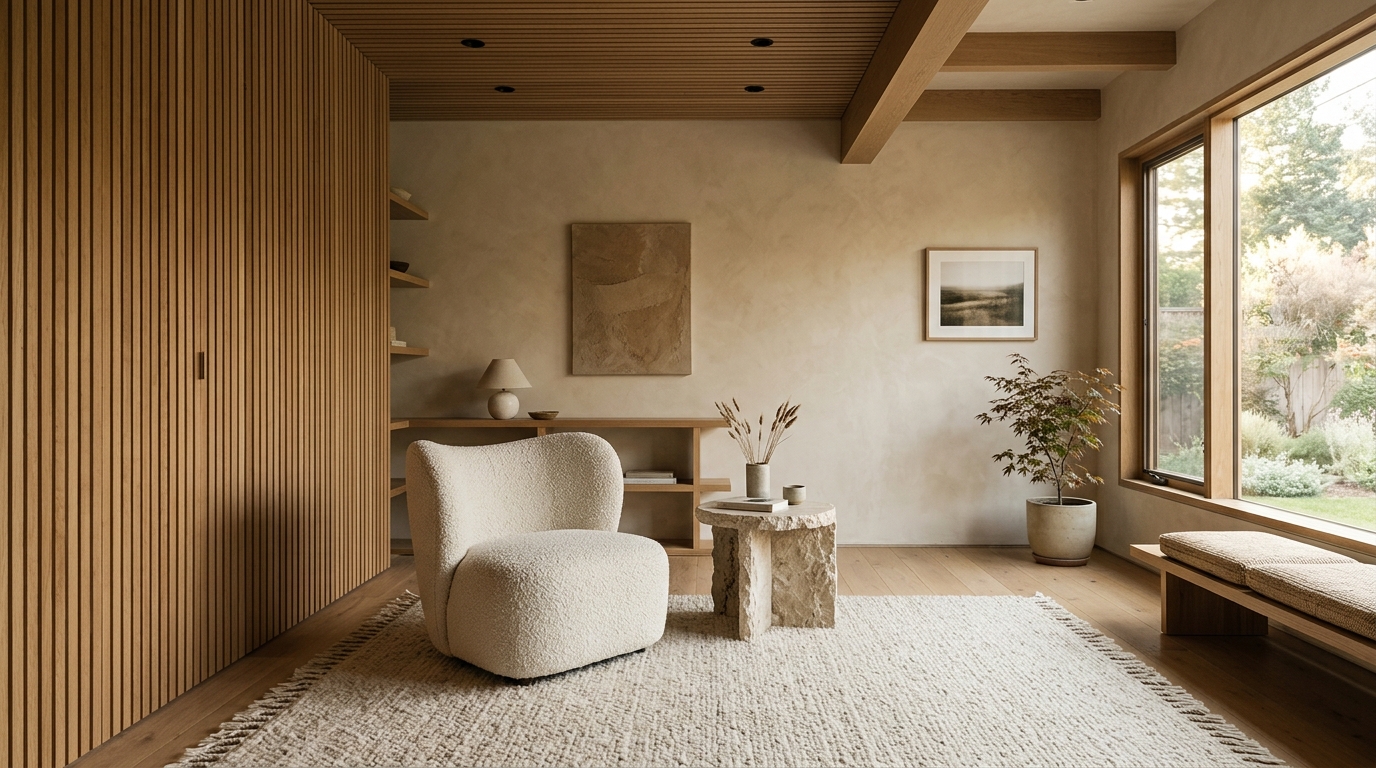
A fluted or ribbed wood panel wall reads as a clear design statement. It has rhythm, shadow, and material presence. But because it’s monochromatic in effect- same colour, same material, just varying depth it doesn’t compete with furniture, art, or lighting the way a patterned wallpaper inevitably will. This is a large part of why textured accent walls have become such a reliable choice for people who want a statement without wanting to redesign the entire room around it.
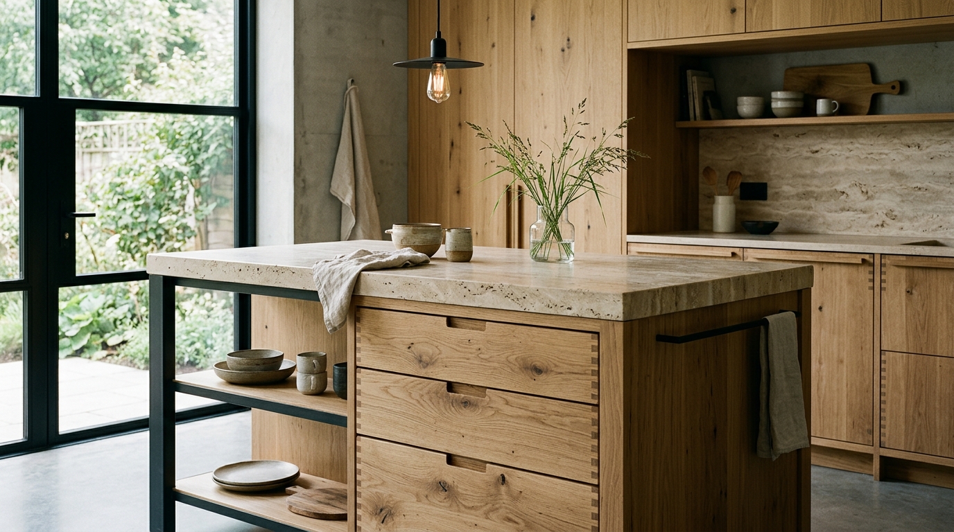
Raw stone, exposed brick, and honed concrete work on the same principle. The visual interest comes from material depth and light interaction rather than printed pattern, which keeps the wall feeling grounded rather than decorative.

Colour Restraint Is What Makes Boldness Work
Counterintuitively, the boldest statement walls often come from a genuinely restrained colour palette elsewhere in the room. A deep emerald or charcoal accent wall reads as confident and intentional against neutral furniture and simple lighting. The same wall against patterned curtains, colourful artwork, and a mix of accent colours in the furnishings starts competing with itself, and the wall stops feeling like the statement; it just becomes one loud element among several.
This is why designers frequently pair a genuinely bold statement wall with an otherwise quiet room. The wall gets to do the visual heavy lifting precisely because nothing else in the space is trying to do the same job. Save the boldness for one element, and let everything else exist to support rather than compete with it.
Scale Matters More Than People Expect
A statement wall that’s technically well-designed can still fail if its scale doesn’t match the room. A heavily textured or richly coloured wall in a small room can feel overwhelming rather than intentional, simply because there’s not enough neutral space around it to let the eye rest. The same treatment in a larger room, with more breathing room on either side, reads as confident rather than cramped.
A useful rule of thumb: the bolder the material or colour choice, the more negative space it typically needs around it to actually succeed. A dramatic fluted wood wall works beautifully as a focal point behind a bed or sofa, where there’s clear visual separation from other elements. The same treatment applied to every wall in a small room, wall to wall and floor to ceiling, usually reads as overwhelming rather than intentional, regardless of how well-executed the material itself is.
Where to Actually Place One
Not every wall deserves statement treatment, and choosing the right one matters as much as choosing the right material. Walls that naturally draw the eye—behind a bed, behind a sofa, at the end of a hallway, facing the entrance of a room—make the strongest candidates, since they’re doing work the room’s layout already wants them to do.
Walls interrupted by doors, windows, or built-in shelving tend to make weaker candidates, since the statement gets visually chopped up before it can fully register. A clean, uninterrupted wall surface lets a bold material or colour decision read as one continuous idea rather than a series of fragments competing with structural interruptions.
Lighting Decides Whether the Statement Lands
A textured or richly coloured statement wall under flat, even overhead lighting loses a significant amount of its impact. Texture needs angled light to throw shadow and create depth; colour needs enough warmth and directionality to avoid looking flat and washed out under a single ceiling fixture.
A wall-mounted light, a floor lamp positioned to one side, or natural light entering at an angle through a nearby window does far more for a statement wall than additional overhead brightness ever will. This is often the missing piece when a well-chosen statement wall still somehow underwhelms in person: the material and colour choices were right, but the lighting never gave them the chance to actually perform.
The Plywood Question Behind Textured Statement Walls
The best statement walls aren’t the ones doing the most; they’re the ones doing one thing with full conviction, supported by a room that knows to stay quiet around them. Whether that one element is a saturated colour, a raw material, or a textured wood panel, restraint everywhere else is what allows the statement to feel intentional rather than accidental. Visual excess rarely comes from being too bold; it comes from not trusting the bold choice enough to let it stand on its own.